Steven Heller: Bascove’s Shifting Perspective
February 15, 2022 – Written By: Steven Heller
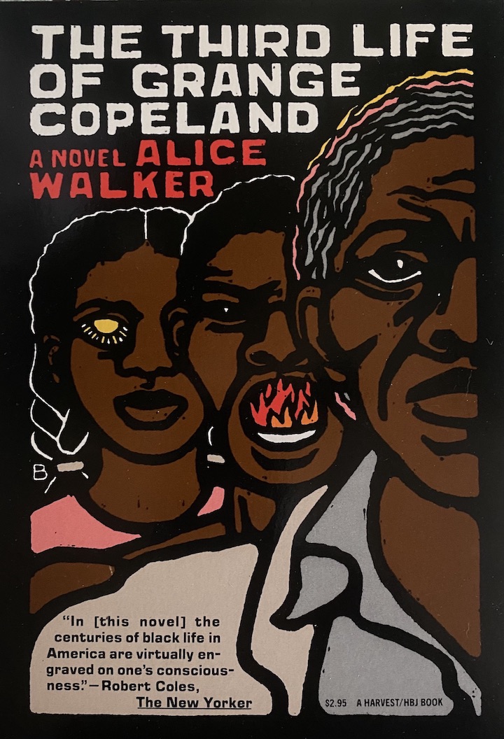
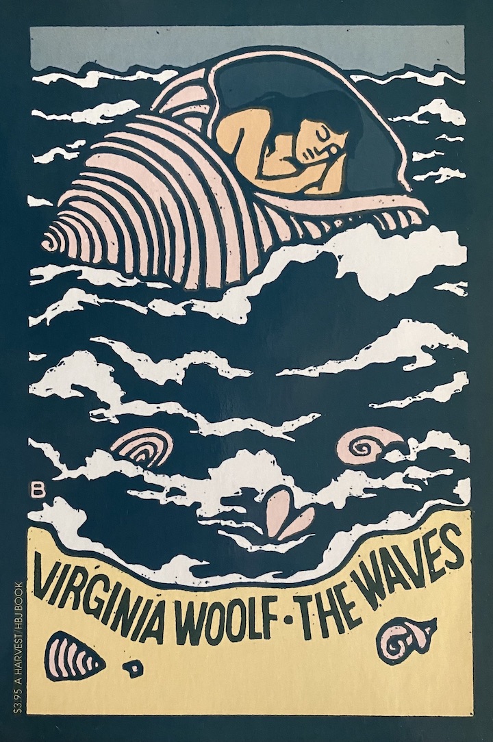
I’ve been enticed and excited by Bascove’s imagery ever since I first laid eyes on her signature book covers and jackets designed for publishers throughout the 1970s and 80s. Her emotionally-charged woodcuts, pen and brush drawings and hand-crafted gothic lettering grabbed my senses and intensified my interest. The books with her peerless illuminations revealing the essence of an author’s work were often put face-out on the shelves of my favorite bookselling haunts.
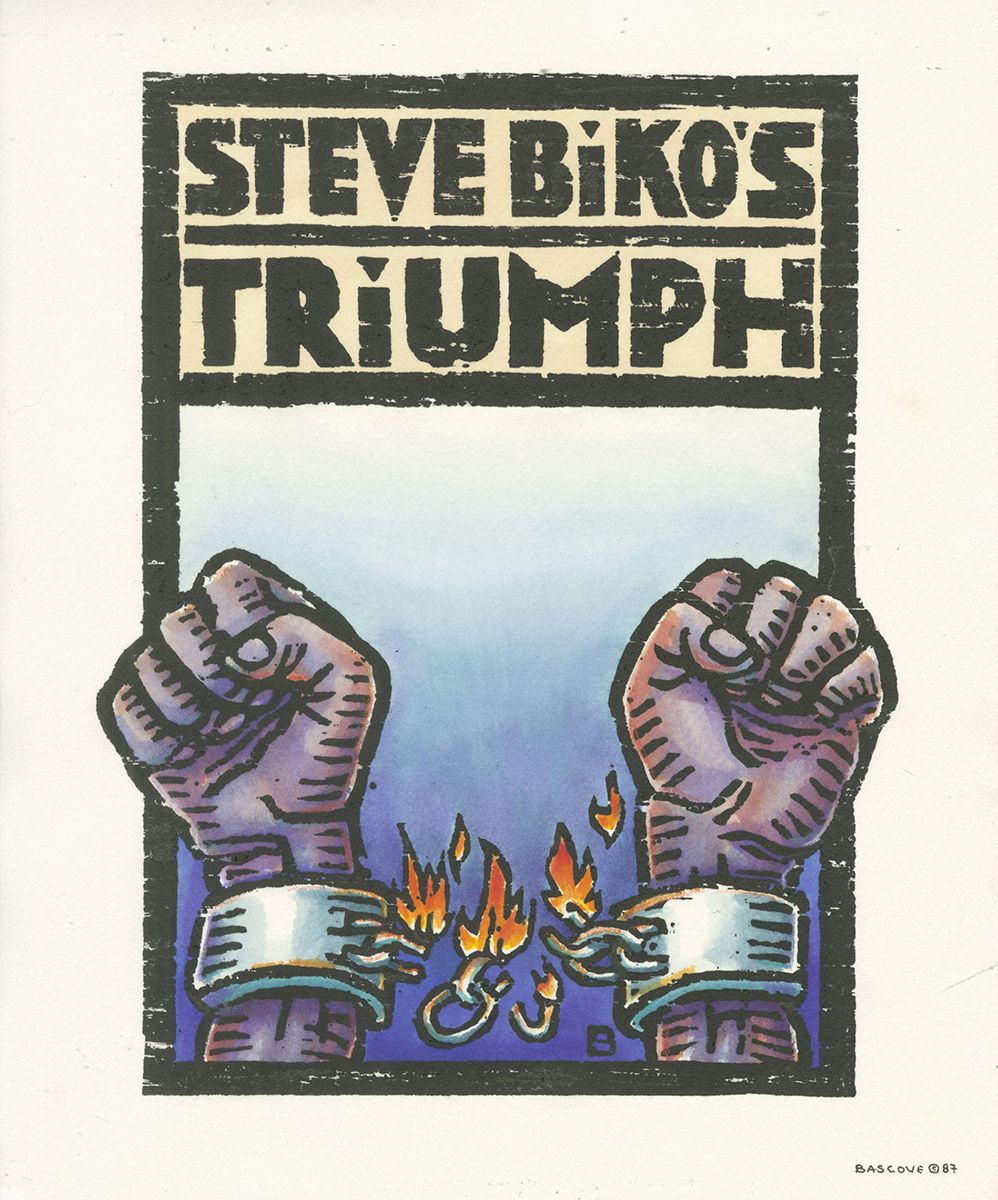
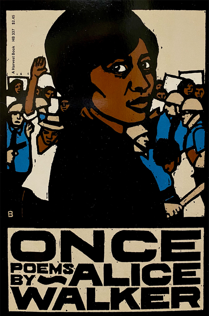
Bascove (the mononym for Anne Bascove b.1946) became the go-to illustrator for various genres of serious fiction, skewing the so-called “big book look”, for more intimate and personal imagery. Much of her imagery was dominated by tormented and emotive faces or figures that carry the weight of a plot or theme. Included among my favorites for their visceral intensity are Alice Walker’s Meridian, Thomas Mann’s Black Swan, Simenon’s Aunt Jeanne, and a most disturbing image of self-cannibalistic prisoners on Mykhaylo Osadchy’s Cataract. Throughout Bascove’s illustration career, she combined a range of distinctive graphic styles from hybrid film noir to German neo-expressionism with a trace of surrealist mystery for good measure. She rode the crest of a wave that infused symbolic and metaphoric representation into American illustration. In fact, she embodied a broader rejection of conventional literalism and romanticism that held sway for decades in book marketing; she transcended commercial norms, imposed new tropes and appealed to readers that had learned to – to rephrase the old truism – tell a book by her covers.
In 1976, Bascove was among a few initiators of a growing wave of conceptual illustrators who worked with me as I attempted to bring to the New York Times OpEd page, where I was the art director, a distinct emotive sensibility that some critics dismissed as lugubrious. In truth, the pages were grey (the Times was nicknamed “The Grey Lady”) and the style of drawing skewed dark. But so many of the published essays demanded it and Bascove, a gifted interpreter, did dark with a engaging lightness of spirit. One of the earliest assignments I gave her was to illustrate a page of three unrelated stories tied together with illuminated capitals that remains one of my favorite page designs because her formal design as well conceptual ingenuity made the components work. I was surprised, therefore, when she told me in an interview we did together for my 1986 book, Innovators of American Illustration: “My imagery was too dark for some people. I was literally told by publishers that if they had jobs needing a dark vision, which was rare, they’d rather give it to a man — a man, they said has a family to support.” Of course, that did not stop her and Bascove’s work was eventually in high demand among those art directors who appreciated the strength of her black print technique.
Around 20 years ago, however, she stopped taking on illustrations and began to seriously paint. It wasn’t a great leap in the formal sense, but for an illustrator to be taken seriously as painter has never been a easy transition. Nonetheless, Bascove’s passions coalesced when she stopped making people and began painting bridges with turbulent expressionist auras. “Bridges create solid ground where there is none,” she explained in an interview. So, the grandeur of these wonders provided an alternative spiritual and artistic focus; she shifted from symbolic individuals to the monumental specific structures, although they implied architects, engineers and pedestrians.


During the past decade Bascove made another leap when she was forced to address severe issues with her balance and proprioception and had to stop painting. Determined not to allow her body to put an involuntary end her art “I took some of my bridge reference photos, the dozens I took for each painting, and started cutting them up and reconstructing them on a piece of board,” she told me about the discovery of an abstract collage method, which employee fragments rather than reality. “For me, the City’s bridges provide inspiration and sustenance, and they’ve become so familiar, I feel like I’m part of them. Seeing new spaces and combinations were like being introduced to them anew.”
Reassembling the geometry and integrating representational imagery in abstract compositions in these new pieces allows Bascove more investigation of space and motion. But all roads lead back to illustration: “I find I’m bringing everything I’ve previously developed into these works,” she admits. “Many of the black shapes could come straight from my woodcuts, the color palette and variations, from my drawings and paintings.” But there is a huge distinction between this and other media she’s used. For collage, she does not make sketches: “I love the spontaneous nature of it, experimenting with balance and color, and, as it grows, locating the areas with the most dynamic force — each piece has a life of its own.”


To find out more about Bascove, visit her profile on the Museum’s Exhibition Page, Bascove: The time we spend with words.