|
New Perspectives on Illustration is an engaging weekly series of essays by graduate illustration students at MICA, the Maryland Institute College of Art. Curators Stephanie Plunkett and Joyce K. Schiller have the pleasure of teaching a MICA course exploring the artistic and cultural underpinnings of published imagery through history, and we are pleased to present the findings of our talented students in this weekly blog.
Punk’s DIY Influence on Contemporary Illustration by Kevin Valente examines how fanzines, or zines, launched a DIY revolution that has infiltrated and redefined the mainstream markets of Illustration and Graphic Design today .
Punk’s DIY Influence on Contemporary Illustration
By Kevin Valente
“Defining themselves against a society based on consumption, zinesters privilege the ethic of DIY, do-it-yourself: make your own culture and stop consuming that which is made for you.”
— Stephen Ducombe, pg 2, Notes from Underground: Zines and the Politics of Alternative
For years fanzines (a combination of the words fan and magazine), have been a powerful form of self-expression and exploration for artists who found no voice or place in the mainstream and established art scene. Fanzines, or simply zines, provide the artist with the opportunity to be art maker, publisher, designer and printer. As such, artists were, and still are, given the chance to create something completely original without the shackles or constraints associated with the mainstream art and publishing worlds. This level of innovation and creativity is best seen
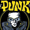
through the Punk era fanzines that are characterized by their intentionally “bad art” pen and ink illustrations, “untutored graphic techniques,” and purposeful references to the artist’s hand (Chwast, Heller 165). With the launch of Punk magazine in 1975 and thus the Punk DIY (do it yourself) aesthetic, outsider artists and mainstream pariahs were finally given a platform to produce the work they wanted to make. It is from these Punk zines that a DIY revolution launched an underground movement — through self publishing, trade shows, zine enthusiasts and eventually the Internet — that infiltrated and redefined the current, mainstream markets of Illustration and Graphic Design today.
|
 The Punk aesthetic, a combination of Dadaism assemblage and antagonistic rejection of classical illustration and design principles, has greatly influenced the art scene since it began in the mid-1970s. Art Chantry, one of the most influential Punk artists, often describes the movement as “a social and philosophical revolution against status-quo positions of reigning norms” (Chwast, Heller 165). Beyond Punk’s obvious influences on CD and album covers, its biggest impact on the art world is found in the movement that began when cartoonist John Holsmtrom founded Punk with Ged Dunn and Legs McNeil. As a magazine, Punk was revolutionary in its time as it provided unbiased and truthful accounts of the growing alternative music scene in New York. “It was distributed in England before the first UK Punk zine was produced,” thus providing the seed in both America and Britain for what would become the so- called Punk DIY conventions of raw “spontaneous page layout, the production values of the photocopier, and a mixture of typographic treatments such as cut and paste, ‘ransom notes,’ and handwritten and typewritten letterforms,” (Triggs 46). However, Punk’s most important impact on the art scene lies in Holstrom’s illustration and hand lettering style that has a “caustically comic appearance, a combination between an underground newspaper and a high school newsletter,” (Chwast, Heller 165). The combination of self- publishing and a healthy disregard to institutional conventions, endowed artists full of freedomof expression that went unappreciated by the mainstream. Consequentially, the Punk DIY revolution was born.
|
As a result of the headway made by Punk magazine, fellow cohorts added to the discussion through their own self-publications. The three most influential fanzines of the Punk DIY revolution include Mark Perry’s Sniffin’ Glue (1976-1977), Charlie Chainsaws’ Chainsaw (1975-1985) and Mick Mercer Panache (1976- 1992). Similar to Punk, each fanzine was developed out of a necessity to provide an alternate source of news, and writings about the Punk music scene in a time when mainstream publications (e.g. Daily Mirror and People) were publishing stories sensationalizing the aggressive nature of the scene, rather than providing honest, truthful reporting of the music and alternative culture (Triggs 46). The advent of British zine Sniffin’ Glue fully developed the framework of the DIY aesthetic through its slapped- together staple binding, rough, all caps hand scrawled titles, photo collages and cartooning. Chainsaw furthered this Punk aesthetic through innovative color pallets and bold graphic color blocks, while Panache spoke to the anarchic and subversive
nature of the revolution by flaunting “typographic mistakes, overcrowded pages and grainy photographic images.” (Triggs 53-54). Thus it is through the raw, handmade quality of these publications, as well as, the experimentation
found in each through typography, collage, unadulterated drawings and crass cartooning bestowed the underground, alternative art scene with the inspiration, gusto and tools to create — in a prolific manner — imagery and zines free of restrictions.
The innovation and aesthetics of these Punk zines launched a DIY revolution that has transformed the face of Illustration and Graphic Design today. Many modern day Illustrators are greatly influenced by notion of taking complete artistic control of their work; this is to say that instead of simply creating an illustration, more and more Illustrators are merging the role of artist and designer by incorporating their own hand lettering, setting type themselves, and even controlling the layout of piece itself inside of a publication. Moreover, the DIY influences of Punk zines become even more apparent when one looks at the compositions, collage/assemblage techniques, bold graphics, and deliberately quirky and styled line drawings of such currently prominent Illustrators as Mikey Burton and Hattie Stewart.
As an Illustrator, Burton refers to his art as “designy illustration,” which is exactly reflected in his use of bold blocks of color, confident usage of typography, and hyper clean lines (Burton 1). His most well known work, a series of six book covers that he completed during his MFA thesis year at Kent State (Burton 2), speaks directly to the influences of the Punk DIY aesthetic. Each illustrated cover features hand lettering that is experimental and uniquely his own; drawing parallels to the raw handwritten titles found on the covers of Panache. Furthering this parallel, one only needs to look at the manner in which Burton references collage through the covers of Animal Farm and The Outsiders, which each features a combination of graphic elements (e.g. the blocky hand cut type, scanned in cut paper skull, textures alluding to the process of relief and screen printing) that although digitally assembled pay homage to the zine sensibility through disregarding of the notion that book design has to be clean, set on a grid and have perfectly kerned typography. The allusion is immediately made to DIY aesthetic, and thus it is clear that Burton would not have been able to make such innovative and intriguing covers without the advent of the Punk DIY fanzine.
|
|
|
|
Similar to Burton, Stewart’s work is greatly influenced by the handmade, Punk DIY aesthetic. Although Stewart is a published Illustrator with well-known clients, like her forefathers of antiestablishment she disregards the mainstream ideal of commercial art, using instead a style of drawing that referential to the graphic comics and bizarre illustrations found on the covers and in the pages of Sniffin’ Glue and Chainsaw (Triggs 50, 53-54). Her inked black and white drawings perfectly emulate the feel of outsider art; speaking to an audience who would rather see graphic, bold imagery that disregards the current trend of super sleek, complex and vividly colored illustrations for imagery that speaks to the instantaneousness of doodles and hastily scrawled comics. Another parallel can be made by clear reference to a style of loose, off- the-cusp, personal sketches, which plays to the viewer’s empathy and as such makes the work so much more intimate. This of course is not to lower the level of Stewart’s work, as it done masterfully and with an apparent intent to be both sincere and showcase a style of illustration
that is not widely on display. Furthermore, a person who has seen her work once, would undoubtedly recognize it again and know that it belonged to her, which is refreshing in a field where so much is homogenous.
|
|
Beyond her stylization of characters and figures, Stewart’s work draws more parallels to the Punk DIY zines through the use of limited bold color pallets and her work on magazine covers, in which she paints directly on top of the photographs. By covering the photographs with patterns and often replacing the faces of individuals with faces of her own quirky characters, Stewart, similar to the Punk zine pioneers, rejects the sacredness of the photographic print Home parallels the homage to Dadaism through the combination and re-appropriation of found imagery. Thus, like Burton, Stewart’s work owes much to the pioneering zinesters, who without would have not allowed such stylization, and such level of the artist’s hand to appear in illustration and design today.
Looking beyond contemporary Illustrators, it is clear that the influences of the Punk DIY fanzines found in Illustration has also greatly influenced contemporary design. Critically viewing the recent work design work from companies such as Urban Outsiders and Kiosk provides a clear example of how the purposeful and notorious rejection of basic design principles of clean type, grid order, and hierarchy synonymous of Punk DIY zines has directly influenced the raw, low-art feel of the advertisements and websites of these two companies. Mark O’Brien furthers this notion by stating that “aesthetics and ideologies of DIY punk zines have influenced modern-day practices of corporate marketing, web networking and mainstream publishing” as well. This is extremely profound considering these institutions have commandeered the Punk DIY aesthetic, a style rooted in the underground, for the outsider, and as an effective tool in the mainstream for both applied imagery.
|
However, the zenith of Punk DIY influence is found in the Danish newspaper Politken, in which all formal elements of design are thrown out the window. The 2011 redesign features a front page that is completely hand drawn and hand lettered (Steele 1). The page has no apparent logic or hierarchy, and showcases a layout as chaotic as Panache. It is bizarre and incredibly fascinating all at once, especially since a newspaper in its basic ideology parallels the principle of design that functionally and readability are the utmost importance. Newspapers are designed to be easily deciphered and understood, and Politken, much like the Punk illustrators of their time, throws caution to the wind, choosing to produce a publication emphasizing the power of the human hand and our affinity to handcrafted material. Therefore, it is amazing that Politken, now some thirty years later has used what made Punk fanzines so revolutionary, and has effectively, and yet somewhat ironically carved a hole for it in the mainstream. Thus, it is clear that the Punk DIY revolution has come to full realization, subversively infiltrating the art world all the way up to the mainstream markets.
Having started thirty odd years ago as an antiestablishment movement, Punk fanzines birthed into existent a DIY revolution that has transformed the way contemporary art practices are considered today. The revolution has infiltrated the applied commercial art fields of both Illustration and Graphic Design, allowing artists the ability to create work that shows the power, skill and individuality of the artist’s hand. This is an amazing feat considering that today most of the Illustrators and Graphic Designers that so freely reference (consciously or not) the aesthetic of collage, hand lettering, and intentionally cluttered compositions inspired by the Punk DIY fanzines where not even alive during its heyday. This not only speaks to the cyclical nature in which styles come in and out of fashion, but ultimately to the power and innovation of an and small shops in New York. Finally, the voices of the underground are heard by us all.
|
|
Works Cited
Duncombe, Stephen. Notes from Underground: Zines and the Politics of Alternative Culture. London: Verso, 1997. Print.
“Hattie Stewart – Illustrator – Home.” Hattie Stewart – Illustrator – Home. N.p., n.d. Web. 10 Dec. 2012.
Heller, Steven, and Seymour Chwast. Illustration: A Visual History. New York: Abrams, 2008.
Print. Pages 164-165.
“KIOSK.” KIOSK. N.p., n.d. Web. 10 Dec. 2012. http://kioskkiosk.com/
O’Brien, Mark. “Rock, Paper, Scissors: The DIY Punk Zine and Its Influence in Contemporary Visual Culture.” Rock, Paper, Scissors: The DIY Punk Zine and Its Influence in Contemporary Visual Culture. Web. 10 Dec. 2012.
“PunkMagazine.com Homepage.” PunkMagazine.com Homepage. Web. 10 Dec. 2012.
http://www.punkmagazine.com
Steele, Lee. “The Society for News Design.” The Society for News Design SND RSS. N.p., 14 Feb. 2012. Web. 10 Dec. 2012.
Triggs, Teal. Fanzines: The DIY Revolution. San Francisco, CA: Chronicle, 2010. Print.
“Urban Outfitters.” Urban Outfitters. Web. 10 Dec. 2012.
.
|
|