
Beyond Objectification: Norman Rockwell’s
Depictions of Women for the Saturday Evening Post
Haley M. Palmore
Art History Senior Thesis Seminar
Jenny Carson
December 19, 2013
It is widely accepted that Norman Rockwell reflected the American experience and identity through, among other work, his covers for the Saturday Evening Post, (1) however his work also notes the diversity within the American experience. Rockwell seems to take special care to create images defining not only the American identity, but more specifically the experience of women in America. His career, from his first Saturday Evening Post cover in 1916 and going well into the 1970s, overlapped with almost constant progression in women’s rights. From the decision of Congress to endorse the Nineteenth Amendment in 1920, a great success for the National American Woman Suffrage Association (NAWSA), (2) the flight of Amelia Earhart in 1932, (3) the shifting role of women during World War II era of the 1940s, the prohibition of sex discrimination by employers in the 1964 by the Civil Rights Act, (4) and so many more momentous events leading up to the ever more numerous milestones in the 1960s and 1970s. All of these events contributed to a shifting presence of women in society. As much as Rockwell is often categorized as conservative and old fashioned, a closer look at the narratives he creates shows subtle, yet undeniable, resistance to old-fashioned gender roles and conventions in art and advertisements.
Because the Saturday Evening Post was so prevalent in the lives of Americans, Rockwell’s images reached a wide audience and carried great cultural influence. By 1929, the Saturday Evening Post had a readership of around 20 million, having far more influence than movies and radio, and even competing magazines (5). Cyrus Curtis [Figure 1.] purchased the magazine, which was essentially dying out, in 1897 for only $1,000, and at the time it had a circulation of only 2,231 (6). He originally envisioned that the magazine would be for men, however it was eventually realized that while men were purchasing the magazine, the new business-related stories and articles that the new Post now promoted also appealed very much to their wives (7).


Figure 1. Cyrus Curtis circa 1913 Figure 2. George Horace Lorimer 1922.
Magazines were relatively affordable, at five or ten cents apiece, making them an widely accessible source of information and entertainment for a large audience (8). Much of the Post’s growth in success is attributed to the young editor that Curtis hired, George Horace Lorimer, [Figure 2.] who became editor in 1899 (9) and retired in 1937 (10). In his autobiography, Rockwell says that “[Lorimer] had built the Post; it had been nothing and he’d made it a great magazine – his magazine.” (11) An early and prominent editor of the Post, Lorimer, had the conscious goal of creating an American identity, as he felt the country lacked this sense of Americanism (12). Rockwell’s images, in a way, were exactly in line with Lorimer’s desires for the Post.(13)
Attracting a female audience became a goal of the Post in the early 1900’s, and the magazine tried multiple approaches. In her study of George Horace Lorimer’s time at the Post, Jan Cohn describes the early Post’sattempt at including a female viewership, and notes that their approach relied heavily on advertising and promoting consumerism. The Post announced on June 28, 1908 that the previously young business-man-oriented magazine was “Not for Men Only.” (14) Curtis, owner of both the Post and Ladies Home Journal, explained that the Journal was geared towards women to “give you people [advertisers] who manufacture things that American women want and buy a chance to tell them about your products.” (15) Such was the attitude Curtis directed toward his female readership, and the Post, at first, was no different. Women were the main purchasers of goods in the country, something that the magazine recognized. Cohn describes the magazine’s progression from simply targeting adds for female consumers, to writing articles about women, but not really directed toward them as readers, to finally writing articles for women to read that were not merely about products that they should buy. All of this took place before Rockwell began working for the Post, however it seems consumerism and female readership are often still associated.(16)
Rockwell’s awareness of the Post’s aesthetic and method of depicting women is clear, even before he began working for the magazine. As a young artist, one of Norman Rockwell’s fantasies was to have a picture of on the cover of the Post. (17). Knowing that it was popular to portray beautiful women on magazine covers, Rockwell had prepared a few elegant scenes with women and ballerinas for his much-anticipated first visit to editor George Lorimer of the Saturday Evening Post. Having become tired of creating work for mainly children’s publications, Rockwell was eager for a change and for an adult audience to see his work. (18) A cartoonist named Clyde Forsythe, a friend of Rockwell’s, encouraged him to submit work to the Post, and eventually succeeded in his efforts. When Rockwell finally gave in, despite his insecurities about his painting, and created two images – one of a man and a gorgeous woman and one of ballerinas – Forsyth had a very negative response.
“C-R-U-D, crud,” he said on seeing them. “Terrible. Awful. Hopeless. You can’t do a beautiful seductive woman. She looks like a tomboy who’s been scrubbed with a rough washcloth and pinned into a new dress by her mother. Give it up. (19)
He continued to say that Rockwell ought to stick to what he drew best, children, and that the Post would love it. Rockwell took his good friend’s advice and the magazine did accept his cover featuring children. While it was images of children that got his foot in the door at the Post, Rockwell did create many covers featuring women throughout his career there – though they never did seem to fit the sensual conventions that Forsyth stressed. Maybe this aspect of his style lent itself to the more honest and relatable depictions of women seen throughout his covers, as opposed to the ever-fashionable stereotypical beauty queens that made other illustrators successful.
One such artist, who made his reputation painting beautiful women, was Coles Phillips. In his autobiography, Rockwell makes a very clear comparison between himself and Philips, who he describes as “the celebrated pretty-girl artist (20).
Every artist has his own peculiar way of looking at life. It determines his treatment of his subject matter. Coles Phillips… and I used to use the same girl as a model. She was attractive, almost beautiful. But in his paintings, Coles Phillips made her sexy, sophisticated, and wickedly beautiful. When I painted her she became a nice sensible girl, wholesome and rather drab. (21)
In the same conversation, Rockwell recounts “Somebody once said that I paint the kind of women your mother would want you to marry.” Rockwell’s belief that his depictions of women were “drab,” or somehow plain seems a touch too critical. His depictions were not sensual, but rather seem relatable and approachable. This comparison between himself and Coles Phillips directly suggests that it is simply how he sees women as opposed to the way Phillips sees them. The artist’s “peculiar way of looking at life” determines how he portrays his subject. This would seem to be Rockwell’s polite way of pointing out that Phillips looked at women very differently than himself, in a much more sexual and objectifying way.
Looking even at Rockwell’s earlier works for the Post already reveals some notable differences from his contemporaries. Rockwell’s cover from May 3rd 1924, entitled Thoughtful Shopper, [Figure 3] portrays a young girl, bags and merchandise in hand, looking observantly at the old, grouchy shopkeeper. The old man has begrudgingly donned one of the floral hats the girl has selected, holding in hand another, barely able to contain his frustration as the girl takes her time making the careful decision. While the image is not depicting a grown woman, it is addressing an important aspect of the Post’s history; namely consumerism. The issues surrounding advertisement have a particular importance in regards to their female readership.
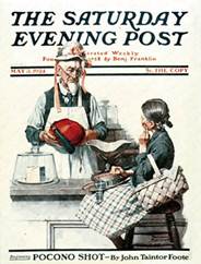
Figure 3. Norman Rockwell, The Figure 4. J. C. Leyendecker: April
Thoughtful Shopper: May 3, 1924. 15, 1922.
A simple comparison to Rockwell’s Thoughtful Shopper is another Saturday Evening Post cover from the same time period and of a similar subject matter, by J. C. Leyendecker. Leyendecker was about twenty years older than Rockwell, and was another incredibly influential illustrator for the Post, perhaps only really rivaled by Rockwell himself. In addition, Rockwell admired him. Only a few years prior to Rockwell’s shopper, Leyendecker painted a lovely woman wearing a new hat, with the opened hatbox before her. [Figure 4.] This is an interesting comparison because while it was common for the magazine to feature the typical composition consisting of one beautiful young lady, often holding a prop or wearing something to imply narrative, Rockwell has taken the popular theme of shopping and added his quintessential sweet humor. He creates a much more dynamic and engaging illustration by swapping the beautiful young lady not just for a little girl, but even placing the coveted hat on a wrinkly and angry old man. While it does still acknowledge the theme of femininity and its link to consumerism, Rockwell does something unique: He places a female character within the comic narrative. It is very rare, looking across all illustrations by numerous artists for the Post, to find scenes where a female character is engaged in a humorous narrative. In the 1920s, Post covers by J. C. Leyendecker, Ellen Pyle, Neysa McMein, Pearl L. Hill, and many others, all seem to fall into the standard of beautiful women, in beautiful clothes, often gazing out at the viewer. While the Post may have been trying to appeal more to female readers, Leyendecker’s image of the lady with her new hat would fall into this same category of pictures designed mainly, as Jan Cohn describes, “as objects of beauty and allure.” (22) If it is designed for women at all, it seems likely that it is merely targeting them as consumers. Cohn also aptly describes these types of images as “fetishes of consumerism.” (23) While Thoughtful Shopper may share the same theme of purchasing clothing, Rockwell’s image overcomes both target audiences, making this an image for men, women, or children, and not objectifying female beauty.
It is rare to find covers where Rockwell actually does conform to the popular convention of portraying idealized women. Even examples where he portrays beautiful women, as he said was nearly impossible to break from, he does so with greater sensibility and narrative complexities. In his autobiography, Rockwell explains the challenge of depicting young women because there is an expectation for them to be beautiful and this makes it difficult to create a humorous image:
The one unforgivable sin in illustration is to paint a woman who is not ravishingly beautiful. Even a normal looking woman is barred. A friend of mine was once assigned a story entitled “The Ugly Woman.” He stewed over it for months. Finally he figured that the only thing to do was show the woman’s back. (24)
Along with the expectation that women be depicted as beautiful, there were of course conventions for how men were portrayed. While Rockwell explains that men should also be depicted as handsome, even if they are rugged, he hardly suggests that it is an “unforgivable sin” of illustration to show an average looking man. Looking at other illustrators at this time, it is clear that while Rockwell does, in some ways, give in to this convention of beautiful women on magazine covers, a long tradition with the Post among other magazines, it is notable that his depictions of women generally seem to suggest more about the individual than focusing exclusively on her beauty.
Three Gossips, [Figure 5.] a Post cover by Rockwell from January 12 1929, is an apt example of Rockwell portraying women as the focus of his humorous narratives. While these ladies would be best described in his other common theme of older folks, (25) the artist’s decision to use unglamorous older women instead of young idealized women is what gives this picture its hilarity. Compare this image with John Lagatta’s cover from December 5 1931, just a few years later, of three young ladies sharing a secret. [Image 11]
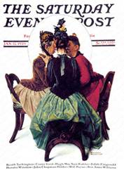
Figure 5. Norman Rockwell, Figure 6. John Lagatta, December 5,
Three Gossips: January 12, 1929. 1931.
All three girls in the Lagatta image are dressed elegantly in brightly colored dresses with high-heeled shoes, their expressions and gestures not really hinting at the information they are sharing. In contrast, Rockwell’s gossips are dramatically leaning into the center of the composition, eagerly listening with their faces only inches apart. They also appear to be dressed in elegant clothing, however their exaggerated features, large ears and long skinny necks, are not meant to inspire the viewer to admire their beauty, like the Lagatta gossips do. Looking at Rockwell’s image, the viewer can perhaps imagine, or at least might really like to know, what these women are so intently discussing. In this image, it might be argued that Rockwell is breaking his aforementioned “unforgivable sin of illustration,” to show ordinary looking women. While these ladies are not young, they can’t exactly be described as elderly either. Rockwell, despite the unpopularity of showing less than stunning women, is much more interested in humor. By letting the theme of gossiping be the real focus of this cover, Rockwell creates characters to enhance the comedy of that theme. Lagatta’s female gossipers are beautiful young women before the viewer understands them to be gossiping. Their elegant poses and clothes and the beauty of their delicate faces take priority over the narrative theme of gossip. Rockwell’s ladies can almost be said to be personifying gossip itself, not just partaking in it. Their astonished expressions and eager poses, sitting at the edge of their seats, leave no question to the audience that these women are gossiping.
The narrative element present in Three Gossips is seldom seen in the work of other illustrators – the closest many artists come seems to be found in covers featuring women utilizing props, like a golf club or an engagement ring, to suggest a story. During the 1930s, Rockwell breaks further from the expectations of female centered covers. His April 12, 1930 cover, Girl running with Wet Canvas, [Figure 7.] is such an example of this kind of deviation from the norm. Here, we are shown a pretty young girl who is the sole figure of the cover, however there is something very different about this image than covers created by other artists during the same period. The scene shows a young woman, painting and wet palette in hand, with an easel under her arm and hands filled with art supplies, mid run and looking straight ahead. The focus is not on her fashion or her pretty face, but on the action that she participating in. The cap that has flown from her head emphasizes the sense of urgency and hurry as she sprints. The significance of all this is that something is learned about this individual from this image. Most notably, Rockwell is portraying this young lady as artist, creating a comparison between his status and her own. The focus of this image is not her beauty or her clothes or body, which are obscured by the various objects she holds and the baggy cape like garment that she wears. This scene is also more about the action and humor of her predicament than her appearance. She is within her own narrative, as she looks straight ahead and is unaware of the viewer.
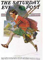
Figure 7. Norman Rockwell, John Lagatta, Woman and Her Palette:
Girl Running with Wet Canvas September 9, 1933.
(Wet Paint): April 12, 1930. Thematically, it is useful to compare Rockwell’s Girl Running with a Wet Canvas to John Lagatta’s Artist and Her Palette, [Figure 8.] from September 9, 1933. While this young lady is engaged in the same activity suggested by the Rockwell cover, the approach to the subject has very different connotations. This girl gazes straight out to the viewer, as if the viewer is where her easel, which is not visible, would be placed. She appears to sit on an invisible chair, her only props being the large palette and brushes. While she is wearing a sort of painter’s smock, her rosy cheeks, red lipstick, and something about her clothing seem to evoke the same fashion-oriented sensibilities seen in so many female depictions from this time. Where Rockwell allowed the viewer to see his young woman’s beautifully-rendered landscape, Lagatta only really offers the suggestion that this elegant young woman is a painter. Likewise, Rockwell’s image seems to say something about the nature of being an artist, the hectic frenzy of meeting deadlines and the messiness of the materials, whereas Lagatta’s image is clearly concerned more with pleasing the male gaze. This woman seems to be little more than a slight variation of the many other depictions of stunning women holding props that suggest actions.
While many other artists chose women engaged in an activity as the subject for their covers, the difference in Rockwell’s handling of the theme is quite evident. One example of a fairly typical female depiction, also from the 1930s, can be found in Guy Hoff’s September 17, 1932 Post cover depicting a girl riding a horse.
Figure 9. Guy Hoff. September 17, 1932.
Like Rockwell’s art student, this woman is taking part in an independent activity, however the image does not give any glimpse into her personality or life. Moreover, this beautifully rendered image seems more focused on her fashion and attractiveness, placing it more within the glamour cover category, with the slight modification that she happens to be on a horse. She also gazes directly out to the viewer, suggesting that what she is engaged in is not truly independent, rather her implied interaction with the viewer suggests that her actions, or appearance, are for the spectator’s benefit.
The placement of both Rockwell’s artist and Hoff’s horseback rider within their given compositions can be likened to conventions in film. In her essay “Visual Pleasure and Narrative Cinema,” Laura Mulvey posits a feminist take on Freudian psychoanalysis as it pertains to film. In it, she describes the convention of “active/male and passive/female” (26) in cinema. (62) She also discusses the role of space in enforcing the passive nature of female characters. Men, she argues, are often portrayed in an environment, “He is a figure in a landscape,”(27) and thus his actions and power within his environment are emphasized. A male viewer of the film, Mulvey explains “identifies with the main male protagonist, he projects his look on to that of his like, his screen surrogate…” Women in film, and evidently in many illustrations, are shown fragmented in shallower depth – a face, a leg – making her into an “icon.” The passive female in film, and visual art in general, is to satisfy the male gaze, of both the male protagonist and the male audience. Unlike many other depictions of women in magazines, Rockwell’s work generally gives all of his characters, male and female, a setting or a suggested narrative of their own, as seen in Girl Running with a Wet Canvas. In Hoff’s image, the woman is placed in a fairly shallow space, cutting off her legs and showing only enough of the horse to imply that she is riding it. It also promotes a broader suggestion of female luxury, which is a particularly interesting detail as this image falls within the Great Depression, while Rockwell’s depiction suggests a girl whose life has deadlines and stress.
There are countless other depictions of women by other illustrators in this same vein. Hoff’s cover from January 21, 1933 [Figure 10.] is almost exactly the same in all respects, except this beautiful young woman, also smiling out at the viewer, is putting on ice skates instead of riding a horse. The one difference is that the girl’s entire figure is within the frame, but still within a very shallow space. She engages the viewer through her beauty and fashionable clothing, not by her actions, as the artist did not choose to show her out on a frozen pond or even gliding across a blank page, but rather the viewer has caught her gracefully pulling on her skates.

Figure 10. Guy Hoff. January 21, 1933.
Another common narrative of the Post that women were a part of was, of course, romance. It should come as no surprise that in the 1930s, scenes that include men act in a similarly objectifying way as covers without them. They emphasize romance, fashion, beauty, and themes like marriage. An interesting cover by Rockwell from this time period is Breakfast Table. [Figure 11.]The scene shows a couple sitting together over breakfast, however the man’s face is obscured behind the newspaper he reads. The woman holds her coffee, peering off beyond the viewer with a sad, and perhaps somewhat annoyed expression at the complete lack of attention received from her husband. This is an unusual depiction from this time because the man’s face is completely hidden, making the woman’s emotion and perspective the complete focus of the painting. Because Rockwell does this in his kindhearted and slightly comical way- the viewer does not become too sad upon looking at the image- he is encouraging empathy for this woman, presumably a housewife who wishes to converse with her husband over breakfast.
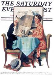
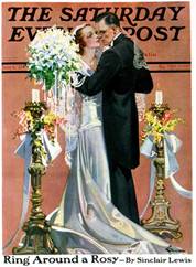
Figure 11. Norman Rockwell, Figure 12. E. M. Jackson, Bridal
The Breakfast Table: August 23, 1930. Couple Dancing: June 6, 1931
Other images from the 1930s Saturday Evening Post covers that feature couples, include numerous examples by artists such as John Lagatta, McClelland Barclay, E. M. Jackson, and many others. (28) While many of these are not particularly unfair to women, they are nonetheless not particularly interesting either. They are idealized and unsurprising images of romance, marriage, and flirting. They act in a very similar way to the glamorous images that featured single female figures, focusing mainly on their attire and celebrity-like beauty. [Figure 12.]
It is not surprising that in the following decade Post covers revolved largely around images of World War II, and Norman Rockwell took a leading role in its depiction.(29) During World War II, the role of women was drastically changed. With most men away at war, there was a need for women to perform tasks that were generally done by men.(30) Magazines were encouraged to promote women fulfilling these responsibilities, in an attempt to attract more women to the workforce. This idea of the American woman was suddenly not just a mother or a housewife, but also a worker and a patriot. In her book, A Century of Women, Deborah G. Felder explains this shift in the workplace inspired by the media outreach to women:
Nearly ten million women went to work in heavy industry, maneuvering giant overhead cranes, cleaning out blast furnaces, handling munitions, driving tanks off production lines, operating drill presses, riveting, and welding. One million women worked for the federal government in offices… Many other women took over prewar “male” jobs, such as bus and truck driver, lumberjack, train conductor, gas station operator, police officer, and lifeguard.(31)
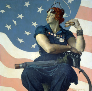
In the midst of this phenomenon of masses of women entering the work force, Rockwell created his iconic image of Rosie the Riveter.[Figure 13.] This depiction was very successful, perhaps because depicting women as intelligent, hardworking, and important was already, while perhaps subtly, present in his work. There is nothing subtle about this 1943 depiction of Rosie, who sits erect, medals around her neck, resting one muscular arm on a riveter while the other holds a sandwich to her face. Below her foot at the very bottom of the composition sits a copy of Hitler’s Mein Kampf, pressed beneath Rosie’s shoe, suggesting that she is helping in the fight against the Nazis. (32) As if the message of her strength, patriotism, and fulfillment of duty were not apparent enough in these details, a large American flag makes up the background and she wears a transparent visor, resembling a halo, raised above her head.
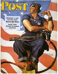

Figure 13. Norman Rockwell, Figure 14.J. Howard Miller, We Can Do It!:
Rosie the Riveter: May 29, 1943. 1943.
Rockwell’s depiction of Rosie represents one of two ways that she was typically depicted. Deborah Felder explains that Rosie was either depicted in this rather unfeminine and muscular manner, like the Rockwell image, or as a more traditional feminine character wearing more form fitting cover-alls. Rockwell’s image, clearly, is a masculine depiction. James J. Kimble and Lester C. Olson describe in their essay outlining the history and several depictions of Rosie the Riveter, that the various details of Rockwell’s depiction “suggest gender ambiguities and violations insofar as they tended to be masculine attributes…”(33) The article also explores the connection, made by other writers as well, between the composition of Rockwell’s Rosie to that of Michelangelo’s portrayal of the prophet Isaiah in the Sistine Chapel. This reference “… may tacitly reinforce the print’s masculinity and its righteousness.”(34)
One example of a more conventionally feminine Rosie, and among the most well known depictions, is by J. Howard Miller, entitled We can Do it!. (Figure 14) While this woman, like Rockwell’s Rosie, is exhibiting her physical strength by flexing her arm, and she appears ready to work, she is at the same time a much more feminine depiction than Rockwell’s. Felder states that the media “preferred to highlight the more feminine qualities of American’s Rosies.”(35) She continues to suggest that these more conventional feminine Riveters emphasized that “she was a housewife and mother at heart, who would (and should) gladly return to her rightful place in the home at the first opportunity.” (36) The realization that magazines could “equate consumerism with patriotism,” led to advertisements, such as Eureka Vacuums making use of Rosie characters. (37) Kimble and Olson note the similarities and differences between these two images in their essay. One important difference is in the feminine appearance of Miller’s Rosie. “Cosmetics affirm
her femininity, including mascara, eyebrow liner, a hint of lipstick, and fingernail polish on one well- manicured fingernail.”(38) Furthermore, the tools that she would use are not present in her portrait, unlike the riveter included in Rockwell’s.
Kimble and Olson suggest that Rockwell’s image had an impact on many women, not just those in the working class. Rockwell’s Rosie the Riveter would have changed the views of wealthier women, for example, by gaining their approval of the female workers, and even prompt them to “avidly support their decisions concerning their public performances of womanhood.” (39)
Liberty Girl, (Figure 15) which Rockwell also made for the Post in 1943, also represents the notion of the American woman who could take care of anything that the country needed of her. In a sort of stars-and-stripes uniform, the girl marches along, covered head to toe with all manners of tools and equipment. In these images, Rockwell almost turns these women into soldiers themselves, soldiers who are equipped to maintain and work for their country while the men are overseas defending it. The girl carries gardening tools, watering cans, milk bottles, a tool kit, and various other objects portrayed with Rockwell’s obsessive attention to detail. Rockwell produced many images celebrating the hard work and dedication of soldiers, but these images remind viewers that women also represent American patriotism and work ethic.
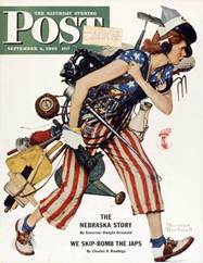
Figure 15. Norman Rockwell,
Liberty Girl: September 4, 1943.
In both Rosie the Riveter and Liberty Girl, each woman is the sole figure, existing in an almost empty and nondescript setting, making them the clear focus of their respective compositions. The emphasis of the American flag is highly noticeable in both, in the background of Rosie, and actually worn by Liberty Girl, drawing the essential connection between woman and country in each portrait.
Shortly after Rosie the Riveter and Liberty Girl came Fixing a Flat, from August 3, 1946. [Image 16] This is an image in which Rockwell truly places his female characters within space and a narrative. In this scene, nearest to the viewer appears a broken down car and two young ladies attending to the flat tire. Behind them and up on a hilltop strewn with garbage and goats is an old dilapidated cabin. On the porch sits a man lounging and smoking. The sign reads “NO TRESPASS,” but with both of the “S”s backwards. The man shows no signs of offering help to the young women, who also seem perfectly capable to handle the situation. Both girls wear nice dresses, one holds the tire while the other, lying on her belly on a towel, is using tools to work.
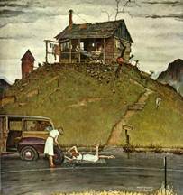
Figure 16. Norman Rockwell,
Fixing a Flat: August 3, 1946.
This image not only shows women as the active figures, but contrasts them with the seemingly lazy male figure. He is almost more a part of the setting than the narrative. In a broader sense, this scene suggests, in a way, the notion of women moving up in the world. Felder notes that after the war, after the men came home, women were conscious of this shift: “ American women had been altered irrevocably by their experiences during WWII. They had helped to make victory possible, and they knew it. Neither they nor their daughters would forget the historical moment when millions of women began to see the promise of equality in the workplace.”(40) She also notes, however that “the values of postwar America, the disruptions of wartime, and the beginning of the baby boom would lead more women back to the home and to idealized suburban lives…” The two women in Rockwell’s image are not two completely lost and helpless young women, unable to fix their flat tire and relying on the man to come to their rescue. Rather, they are seen as “pretty, neat, and practical.”(41) There may be the suggestion that they are better educated than the man, who writes two of the S’s in “trespass” backwards. A few years after this image would mark a period of time where it was more common for young women to attend college – in 1949 Harvard Law school announced that it would be admitting women for the first time.(42) While there was still an overwhelming expectation for women to fill the role of housewife and mother, a movement towards college education was clearly beginning.
By the 1950s, Norman Rockwell became increasingly associated with the image of the Post.(43) As time progressed, cover images of women in general appear to have escaped the beauty queen convention of the 20s and 30s. At this time it was no longer just Rockwell portraying women as active participants of narratives. Works by Amos Sewell, George Hughes, and others create narratives involving or even focusing on the lives of women. These depictions of women shown by other illustrators, however, still seem to lack a certain depth of feeling found in Rockwell’s work at this time. For example, Amos Sewell’s September 12, 1959 cover (Figure 17) is an example of a humorous narrative that focuses on a woman, much like Rockwell’s images. Here a relieved mother is shown lounging on the couch while, beyond the window, her children are walking out to get onto the school bus. Shoes kicked off and feet up, she sips her coffee and reads the paper with a weary but happy expression. While this image is a sweet and humorous depiction of daily life, it reads as a one-liner where the viewer is not really meant to engage with the character depicted or learn anything about her.
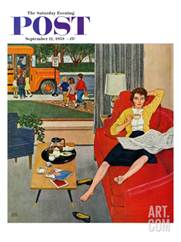
Figure 17. Amos Sewell,
Morning Coffee Break: September 12, 1959.
In contrast, Rockwell’s Girl at the Mirror.[Figure 18] does precisely the opposite, encouraging the viewer, through mood, composition, and art historical reference, to contemplate the individual who is depicted.At first glance, itappears to possess a very different mood than more stereotypical Rockwell paintings. Painted in 1954, the scene is mostly dark, with the brightest part of the composition being the young girl and her reflection. While she is a child, this girl is not the young and tomboy-ish little girls featured in so many of Rockwell’s covers, such as Girl with a Black Eye or Day in the Life of a Little Girl. Instead, we are witnessing a quiet and intimate moment – the girl, with a magazine opened to a page revealing movie star Jane Russell, sits in this dark room before a mirror, contemplating her own appearance. Some lipstick and a hairbrush scattered at her bare feet, and a doll off to the side, it is immediately apparent that this girl is on the verge of leaving behind her childhood toys and her innocent unawareness of her appearance, and entering into the stage of her life where Hollywood and advertisers’ ideas of beauty are suddenly powerful forces in her understanding of her identity.
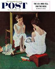
Figure 18. Norman Rockwell,
Girl at the Mirror: March 6, 1954.
Rockwell later regretted including the magazine with the glamorous movie star, saying “The little girl is not wondering if she looks like the star, but just trying to estimate her own charms.”(44) While it still remains somewhat uncertain then what she is estimating her charms against, Rockwell’s regret about the inclusion of the star is nonetheless important to keep in mind. The meaning of the image moves away from being about Hollywood or commercial expectations of beauty with the knowledge that the inclusion of the magazine in the picture was not entirely intentional. We are left with a young girl in a white slip, hair elaborately braded and face adorned with lipstick and blush, simply looking at herself. Rockwell’s statement of regret also shows quite definitively that he did not feel that young girls ought to be looking to Hollywood actresses as a means of shaping themselves or their expectations of beauty. Despite the fact that this sort of image was not unfamiliar or unwelcome at the Saturday Evening Post, Rockwell does not seem interested in defending these images or the influence they may have had on young women.
The setting of Girl at the Mirror also, aside from the magazine cover, removes the girl from any signals of modern or consumerist culture. Aside from the timeless looking setting, Richard Halpern points out in his book Norman Rockwell: The Underside of Innocence, that the subject of a woman looking into a mirror is a convention in history, “of which Rockwell was surely aware.” (45) This convention could be described as “vanitas” images in art history, which highlight human vanity, however Rockwell’s image seems to focus more on coming of age and identity. Halpern continues; “Often reclining, or alone at her toilette, she is set apart from the world of history and heroic achievement occupied by male figures.” His argument progresses to describe the fleeting nature of female beauty and a comparison between Girl at the Mirror and depictions of the Goddess Venus, however this excerpt is of interest because it describes this scene as a means of setting oneself apart from male heroes in history. In this instance, the girl has removed herself from everyone, focusing on her own “charms,” and individuality. By putting this on a cover of a major magazine, Rockwell begs the viewer also to experience from this girl’s perspective, this act of reflection.
Despite being so admired for his talented depictions of children, Rockwell also contributed much more sensitive and observant depictions of women to the cover of the Saturday Evening Post. Rockwell incorporated women into his witty narrative scenes, granting them equality to, and often favor over, the men he depicted. These works seemed to subconsciously prefigure later feminist assertions, like those of Mulvey, about the woman’s place in visual depictions.. Between the 1920s and 1940s particularly, there was not pressure on illustrators to depict women in a more inclusive way, and as is evident by the many other Post artists, Rockwell was ahead of his time in this respect.
End Notes
1) Laurie Norton Moffatt, “Norman Rockwell Museum: Collections in Context.” In American Chronicles: The Art of Norman Rockwell, Linda Szekely Pero (Stockbridge Massachusetts: The Norman Rockwell Museum, 2007.), 8.
2) Deborah G. Felder, A Century of Women The Most Influential Events in Twentieth-Century Women’s History (New York: Kensington Publishing Corp., 2003), 97.
3) Felder, A Century of Women, 146.
4) Ibid, 245.
5) Anne Knutson, “The Saturday Evening Post.” In Norman Rockwell Pictures for the American People, Maurine Hart Hennessey and Anne Knutson (New York: Harry N. Abrams, Inc., 2000), 145.
6) Ibid, 12
7) Ibid,12.
8) Theodore Peterson, Magazines in the Twentieth Century (Urbana, Illinois: University of Illinois Press, 1956), 13.
9) Jan Cohn, Creating America: George Horace Lorimer and the Saturday Evening Post (Pittsburgh: University of Pittsburgh Press, 1989), 27
10) Cohn, Creating America, 266.
11) Norman Rockwell and Tom Rockwell, My Adventures as an Illustrator (New York: Harry N. Abrams, Incorporated, 1988) 288.
12) Cohn, Creating America, 5.
13) Knutson, “The Saturday Evening Post,”144.
14) Jan Cohn, Creating America, 65.
15) Ibid, 66.
16) Cohn, Creating America, 67.
17) Rockwell, My Adventures as an Illustrator, 106.
18) Ibid, 104.
19) Ibid, 107.
20) Rockwell, My Adventures as an Illustrator, 102.
21) Ibid, 34.
22) Cohn, Creating America, 81.
23) Ibid, 81.
24) Rockwell, My Adventures as an Illustrator, 284
25) Jan Cohn, Covers of the Saturday Evening Post: Seventy Years of Outstanding Illustration from America’s Favorite Magazine (New York: Penguin Books Ltd, 1995), 89. .
26) Laura Mulvey, “Visual Pleasure and Narrative Cinema,” in Screen (Oxford: Oxford University Press, 1975), 62.
27) Mulvey, Visual Pleasure and Narrative Cinema, 63.
28) Jan Cohn Jan Cohn, Covers of the Saturday Evening Post: Seventy Years of Outstanding Illustration from America’s Favorite Magazine (New York: Penguin Books USA Inc, 1995), 143-144.
29) Cohn, Covers of the Saturday Evening Post, 174.
30) Felder, A Century of Women, 169.
31) Ibid., 170.
32) James J. Kimble and Lester C. Olson, “Visual Rhetoric Representing Rosie the Riveter: Myth and Misconception in J. Howard Miller’s ‘We Can Do It!’ Poster,” Project Muse: Scholarly Journals Online, 541.
33) Kimble and Olson, “Visual Representation,” 541.
34) Ibid., 541.
35) Felder, A Century of Women, 171.
36)Ibid, 171.
37) Ibid, 171.
38) Kimble and Olson, “Visual Representation,” 539.
39) Ibid, 543.
40) Felder, A Century of Women, 172.
41) Christopher Finch, Reader’s Digest Norman Rockwell’s America, ed. John L. Hochmann(New York: Harry N. Abrams, Inc., Publishers), 38.
42) Felder, A Century of Women, 181.
43) Cohn, Covers of the Saturday Evening Post, 216.
44)Diana Denny, “Rockwell’s Favorite Model, Part III,” Saturday Evening Post Society, accessed December 10, 2013, http://www.saturdayeveningpost.com/2013/03/29/art-entertainment/
45) Richard Halpern, The Underside of Innocence (Chicago: The University of Chicago Press, 2006), 118.
Bibliography
Cohn, Jan. Covers of the Saturday Evening Post: Seventy Years of Outstanding
Illustration from America’s Favorite Magazine. New York: Penguin Group USA Inc., 1995.
Cohn, Jan. Creating America: George Horace Lorimer and the Saturday Evening Post.
Pittsburgh, Pa.: University of Pittsburgh Press, 1989.
Denny, Diana. “Rockwell’s Favorite Model, Part III,” Norman Rockwell Society.
Accessed December 1, 2013. http://www.saturdayeveningpost.com/2013/03/29/art-entertainment/norman-rockwell-girl-at-the-mirror.html
Felder, Deborah G. A Century of Women. New York: Kensington Publishing Corp.,
2003.
Finch, Christopher. Reader’s Digest Norman Rockwell’s America. New York: Harry N.
Abrams, Inc., Publishers, 1975.
Halpern, Richard. Norman Rockwell: The Underside of Innocence. Chicago: University
of Chicago Press, 2006.
Kimble, James J and Lester C. Olson. “Visual Rhetoric Representing Rosie the Riveter:
Myth and Misconception in J. Howard Miller’s ‘We Can Do It!’ Poster,” Project Muse: Scholarly Journals Online.(10 Dec, 2013.)
Knuttson, Anne. “The Saturday Evening Post,” In Pictures for the American People,
Anne Knuttson and Maureen Hart Hennessey. New York, London: Harry N. Abrams, 1999.
Moffatt, Laurie Norton, “Norman Rockwell Museum: Collection in Context.” In
American Chronicles: The Art of Norman Rockwell, Linda Szekely Pero, 8-25.
Mulvey, Laura, “Visual Pleasure in Narrative Cinema,” In Screen (1975) 57-68.
Pero, Linda Szekely. American Chronicles: The Art of Norman Rockwell.
Massachusetts: Norman Rockwell Museum, 2007.
Peterson, Theodore, Magazines and the Twentieth Century. Urbana: University of
Illinois Press, 1956.
Rockwell, Norman, and Tom Rockwell. My Adventures as an Illustrator. Garden City,
NY: Doubleday, 1960.
Rosie the Riveter (detail): May 29, 1943. SEP.